
Blackhawks Jersey History: From 1926 to the Modern Red Home Sweater
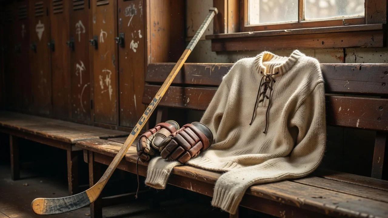
The Chicago Blackhawks sweater is routinely voted the best-looking jersey in professional sports — and it has earned that reputation across nearly a century of hockey. From a wool sweater with lace-up collars in 1926 to today's engineered knits, the design has changed far less than almost any other team's. That continuity is exactly why fans treasure it.
1926 and the birth of the crest
When the franchise joined the NHL in 1926, owner Frederic McLaughlin — a former commander of the Blackhawk Division in World War I — named the team after his unit and, through it, after the Sauk leader Black Hawk. The Indian head crest appeared on the very first sweaters: a profile portrait inside a circle, flanked by crossed tomahawks on the sleeves. The broad strokes of that design are still on the chest today.
The earliest jerseys were simple: black and white stripes at first, then the addition of red in the late 1920s set the palette that would define the club forever.
The barber-pole and the 1955 redesign
Through the 1930s and 1940s the Blackhawks experimented — most famously with the "barber-pole" sweaters of the early 1950s, wrapped in narrow horizontal red, black and white stripes from collar to hem. They were loud, beloved and gone within a few seasons. In 1955 the club introduced the template that endures today: a solid-color body — red at home, white on the road — with wide black and white stripes on the sleeves and hem, the Indian head crest on the chest and the crossed tomahawks with chain-stitched details on each shoulder.
| Era | Key design | Notes for collectors |
|---|---|---|
| 1926–1934 | Black/white stripes, first crest | Original wool, lace-up collars; museum-grade rarities |
| 1935–1950 | Red enters the palette, striped bodies | First Cup-era sweaters (1934, 1938) |
| 1951–1954 | Barber-pole stripes | Short-lived cult favorite; modern replicas exist |
| 1955–1990s | Modern template: solid body, striped sleeves | 1961 Cup; Mikita, Hull and Esposito eras |
| 1992–2007 | CCM/Koho/Reebok edge changes | 1992 Final, move to the United Center in 1994 |
| 2008–2020s | Winter Classic throwbacks, Stadium Series, Adidas & Fanatics | 2010, 2013, 2015 Cup patches drive demand |
The red home sweater
Chicago's red home jersey is the icon. The saturated "Indian red" body, the black-and-white sleeve stripes and the full-color crest make it one of the few sweaters recognizable at a glance from the top row of the United Center. The league flipped home and road colors in 2003 — home teams switched from white to dark — which means the red sweater has been the United Center's home uniform ever since, including all three modern Stanley Cup runs.
Throwbacks and special editions
The franchise leans into its history. The 2009 Winter Classic at Wrigley Field revived the 1930s look; the 2015 Stadium Series brought a bold chrome-crested design; the 2019 Winter Classic returned to a heritage style. Mitchell & Ness and CCM have kept vintage lines — Glenn Hall, Bobby Hull, Stan Mikita era sweaters — in production for collectors, which is why "throwback" Blackhawks jerseys from the 2010s now circulate widely on the resale market.
What this means for buyers
Knowing the eras helps you shop smarter. A "vintage-style" sweater with a felt crest and lace-up collar mimics the 1950s–60s spec. A 2015 Cup-era Reebok premier with the patch is a specific, datable collectible. And the current Fanatics-era red home jersey continues a template that has been essentially stable since 1955 — buy one today and you are wearing a 70-year-old design that still wins best-dressed polls.